Compare Horse Ratings Side-by-Side with the Rating Comparison Chart
The Rating Comparison Chart gives you a visual way to track how multiple horses' RaceMetrics Ratings have moved over time. Line up runners from the same race and spot improving or declining form at a glance.
Selecting Horses to Compare
Start in the Ratings view and use the checkboxes in the left column to select the horses you want to analyse. There's no limit to how many you can compare — the chart supports up to 40 distinct colours, so even a full field can be displayed without overlap.
Need to select everything at once? Click the header checkbox to toggle all horses on or off in one go.
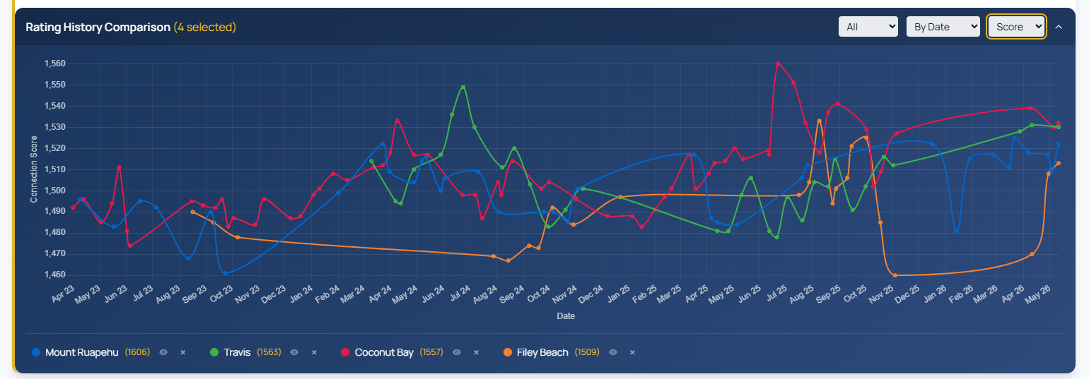
Controlling Your View
Four main controls let you shape the chart to suit your analysis:
- Race range: Choose Last 10, Last 20, Last 50, or All races to adjust how much history you see.
- Rating or Score: Toggle between individual RaceMetrics Ratings or Score mode, which blends your trainer, jockey, owner, dam, sire and damsire ratings into a single weighted line.
- Timeline format: View races as relative positions (Latest, -1, -2) to compare horses with different run frequencies, or by actual date to see gaps between runs.
- Collapse: Tuck away the chart when you need screen space.
Understanding Score Mode
Score mode weights each connection type: Owner and Trainer at 20% each, Jockey at 20%, Dam at 18%, Sire at 12% and Damsire at 10%. The final point on the chart shows today's predictive score based on current ratings — useful for seeing how strong your horse's support team looks compared to previous runs.
Highlighting Lines
Click the eye icon next to any horse name to isolate its line, or click the line itself on the chart. Click again to clear the highlight and see all horses again.