The Command Centre: Spotting Performance Patterns Across Racing
The Command Centre is an interactive performance heatmap built into every RaceMetrics profile — whether you're analysing a trainer, jockey, horse, sire, dam, damsire, or owner. It displays performance across two dimensions at once (say, Course by Month) using colour coding to reveal patterns invisible in raw data: which courses a jockey thrives on, which months favour a particular sire, where an owner's investment pays off.
How to Access It
From any profile page, click the Command Centre tab marked with a purple PP badge. Alternatively, open any racecard, click Command Centre in the view tab bar, and select which participant type you want to analyse. The interface then opens directly to the Command Centre with a race context navigator, letting you switch between participants in the same race without leaving the view.
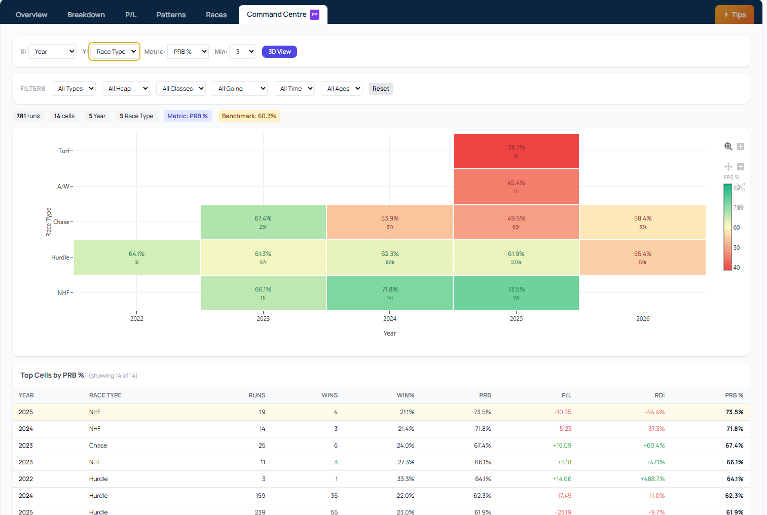
How the Colour System Works
The Command Centre doesn't compare participants against a fixed global scale. Instead, it benchmarks each one against their own performance. If a trainer's overall win rate is 22.9%, green cells show above that rate, yellow cells show typical performance, and red cells show below-average results. An amber badge displays the current benchmark, so you always know what "average" means for that specific participant.
What You Can Measure
Choose two dimensions from Course, Month, Year, Class, Going, Race Type, Distance, or Day of Week. Then select your metric: PRB %, Win %, Place %, ROI %, or Runs. Set a minimum sample size (default 3 runs per cell, 1 for horses) to filter out unreliable data. Toggle between a 3D bar chart and a flat 2D heatmap depending on what suits your analysis.
The Command Centre makes it practical to spot targeting patterns and seasonal trends that would take hours to extract from spreadsheets.